
Bermuda Coffee Studio Specialty coffee has a big problem. When everyone is specialty, no one is. We stepped back and reimagined what you get when you mix coffee and people.
Client
Bermuda Coffee Studio
Role
- Brand Strategy
- Visual Identity
- Verbal Identity
- Graphic Design
- Packaging Design
Industry
Program
Disruption












Info
Bermuda Coffee Roasters was an industrial roastery with walk-in customers, an online store and a growing wholesale wing. Owners Liza and Ben had acquired it along with an identity and a set of decisions that didn’t capture the future of the business. With a flagship venue in Berwick to open, they wanted to reimagine Bermuda. They came to us in a category where every roaster claims specialty, price speaks volumes, and most consumers can’t see the difference. It’s one thing to compete, it’s another thing to compete and win.
We ran Bermuda through our Disruption program with a focus on category design. The work began with the team, articulating their values and discovering their vision.
Specialty coffee has a big problem. When everyone is specialty, no one is. We asked where Bermuda could be the only. We explored positions and categories that could break the template and offer a unique perspective to match. Not a ‘better’ version of what already exists but an entirely new way of defining their business.
Introducing the Coffee Studio.
By definition a studio is a place where artisans create art. See where we are heading here? Instead of defining themselves by what happens in a space, think roasting coffee or serving it. What if it was defined instead by its higher purpose? Not a transaction but an exploration.
Opening up the aperture, we researched the cultural artefacts behind Bermuda. It’s no surprise to anyone that there was a lot of triangle talk and, with it, ideas of being lost. Spooky. What if we put triangles, getting lost and coffee into one room..?
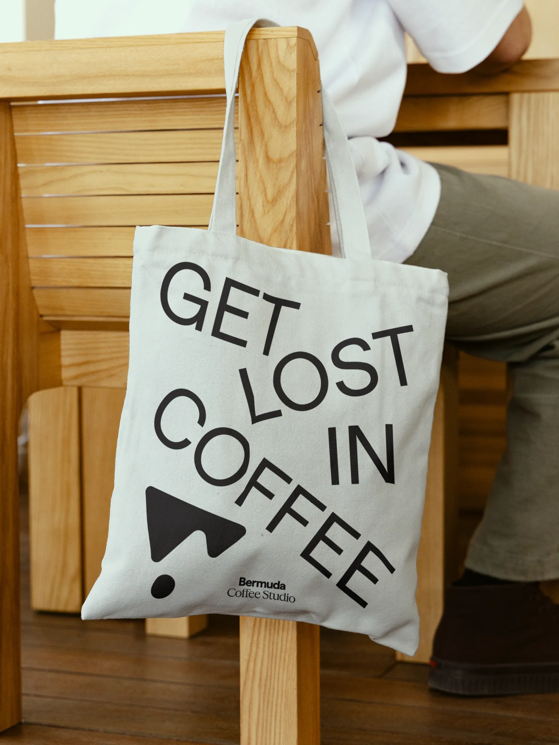
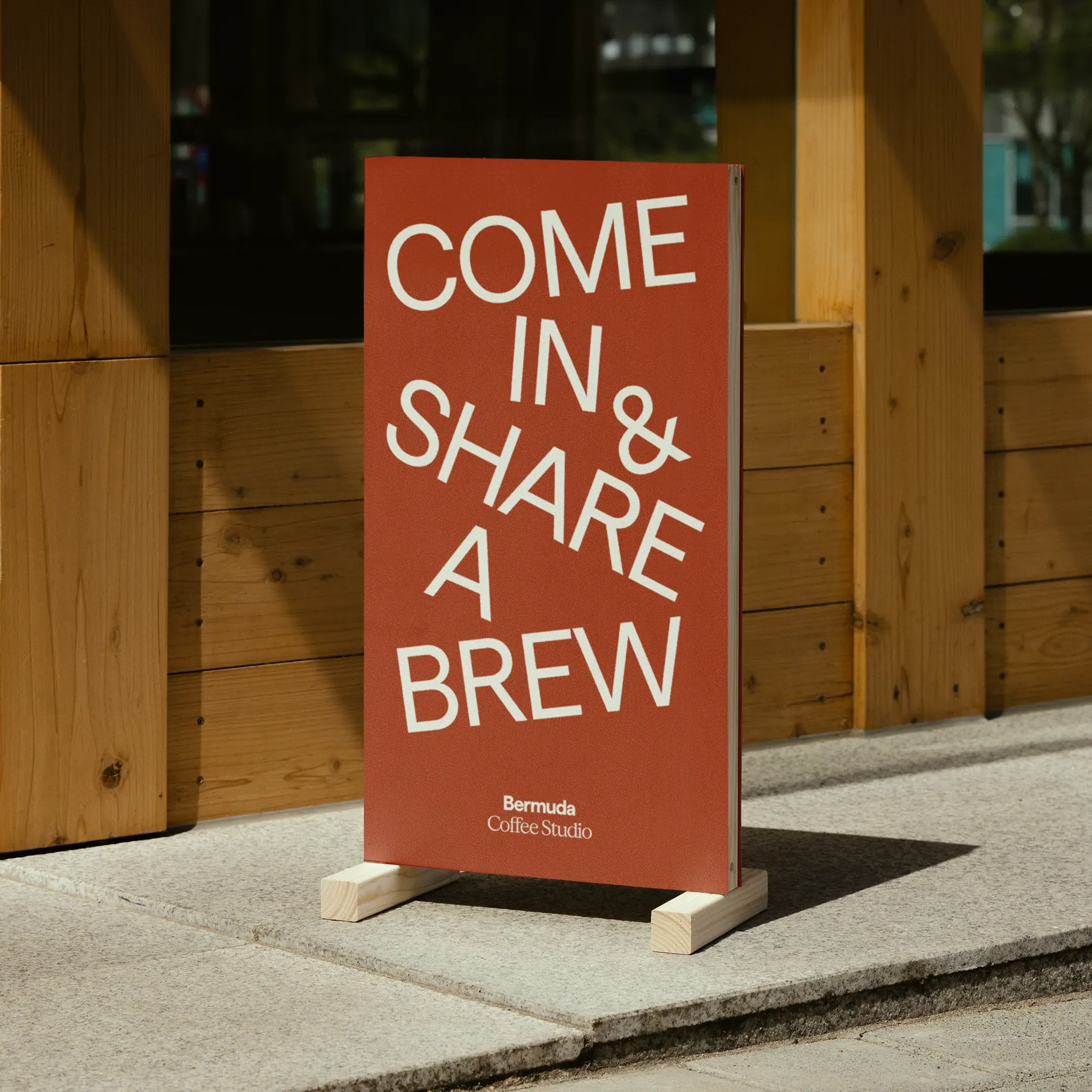
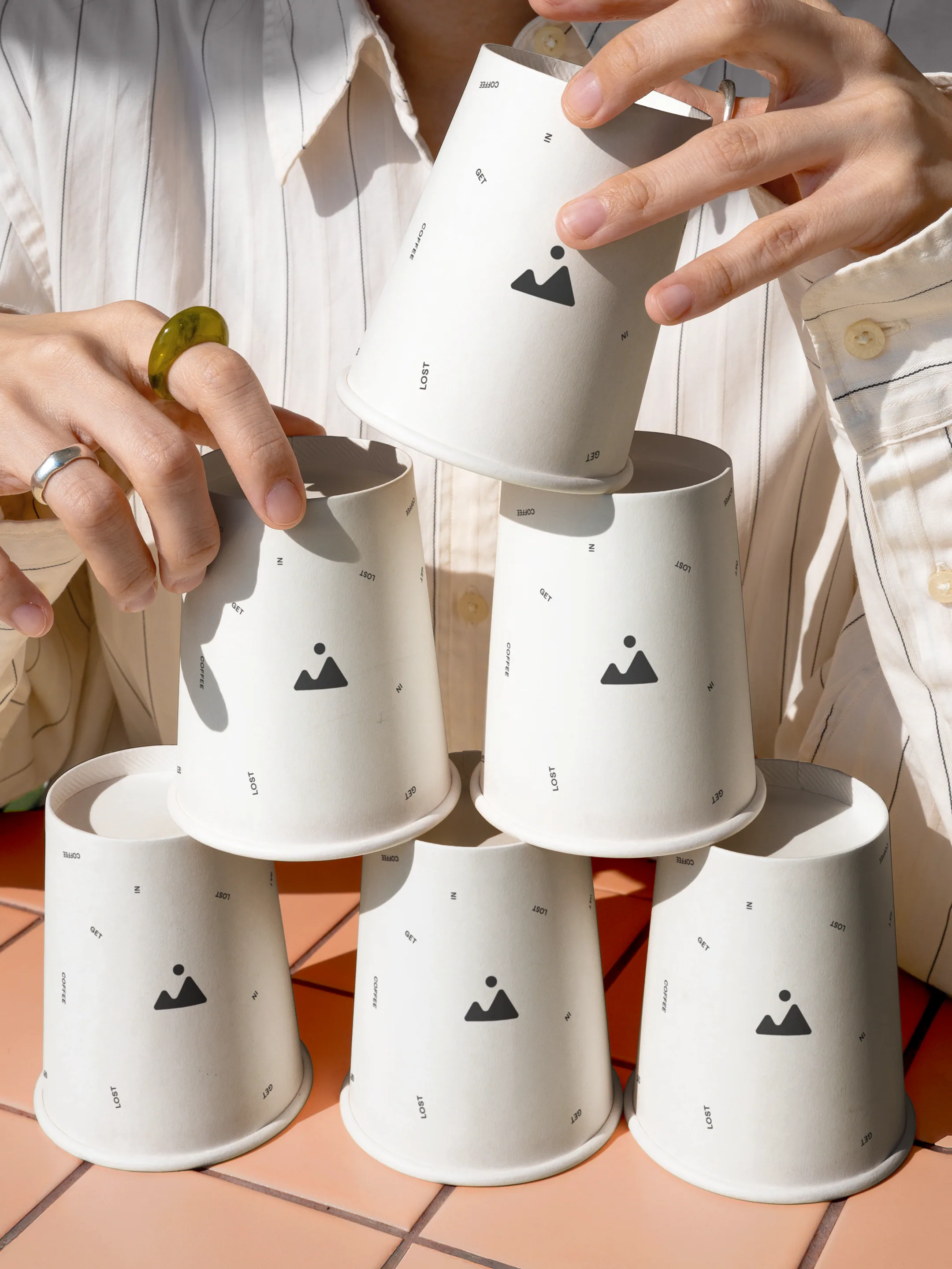
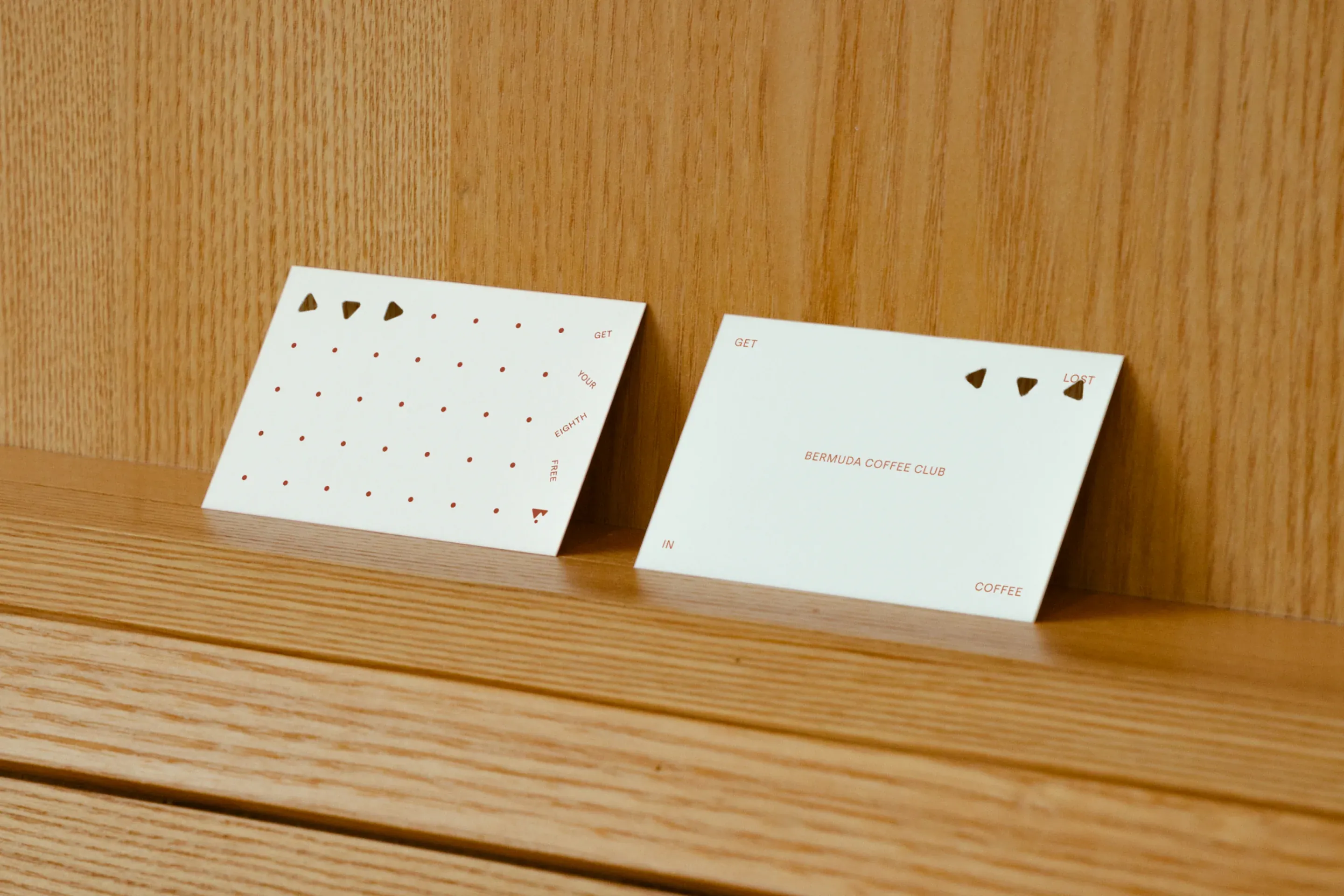
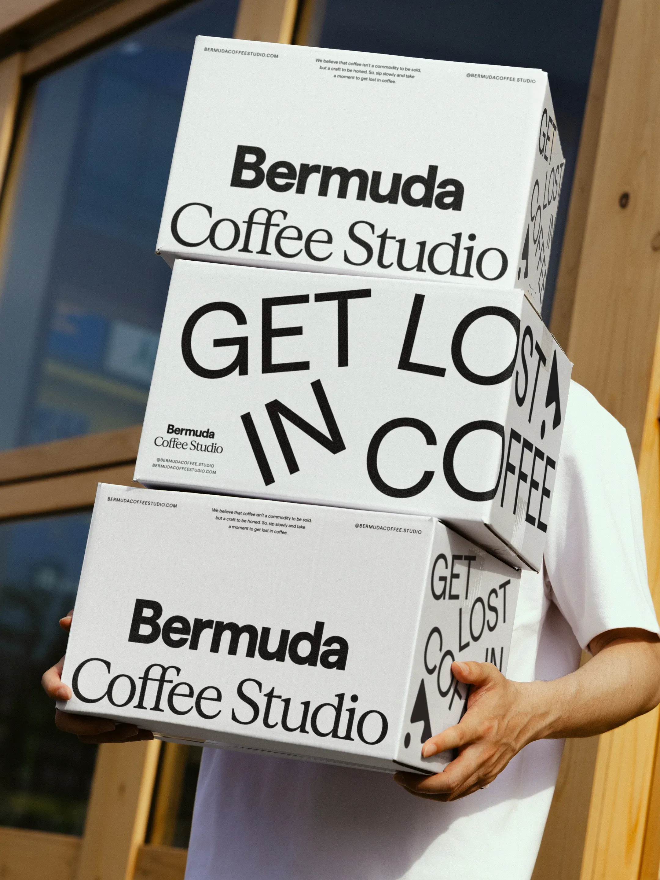
Get Lost in Coffee.
It invites people into a world, to explore, and it turns the brand’s situation on its head: lost in the market became an invitation to get lost in coffee.
The brand story follows the same logic. It analyses the alternatives in the space, names the problem and the opportunity, and then introduces Bermuda as a coffee studio, so the reader arrives at the category before the brand names it. It’s a matter of bringing focus to what the market had lost sight of.
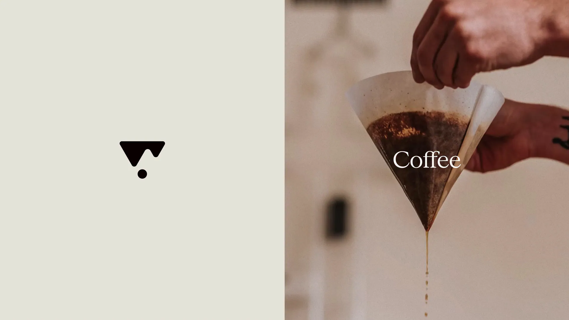
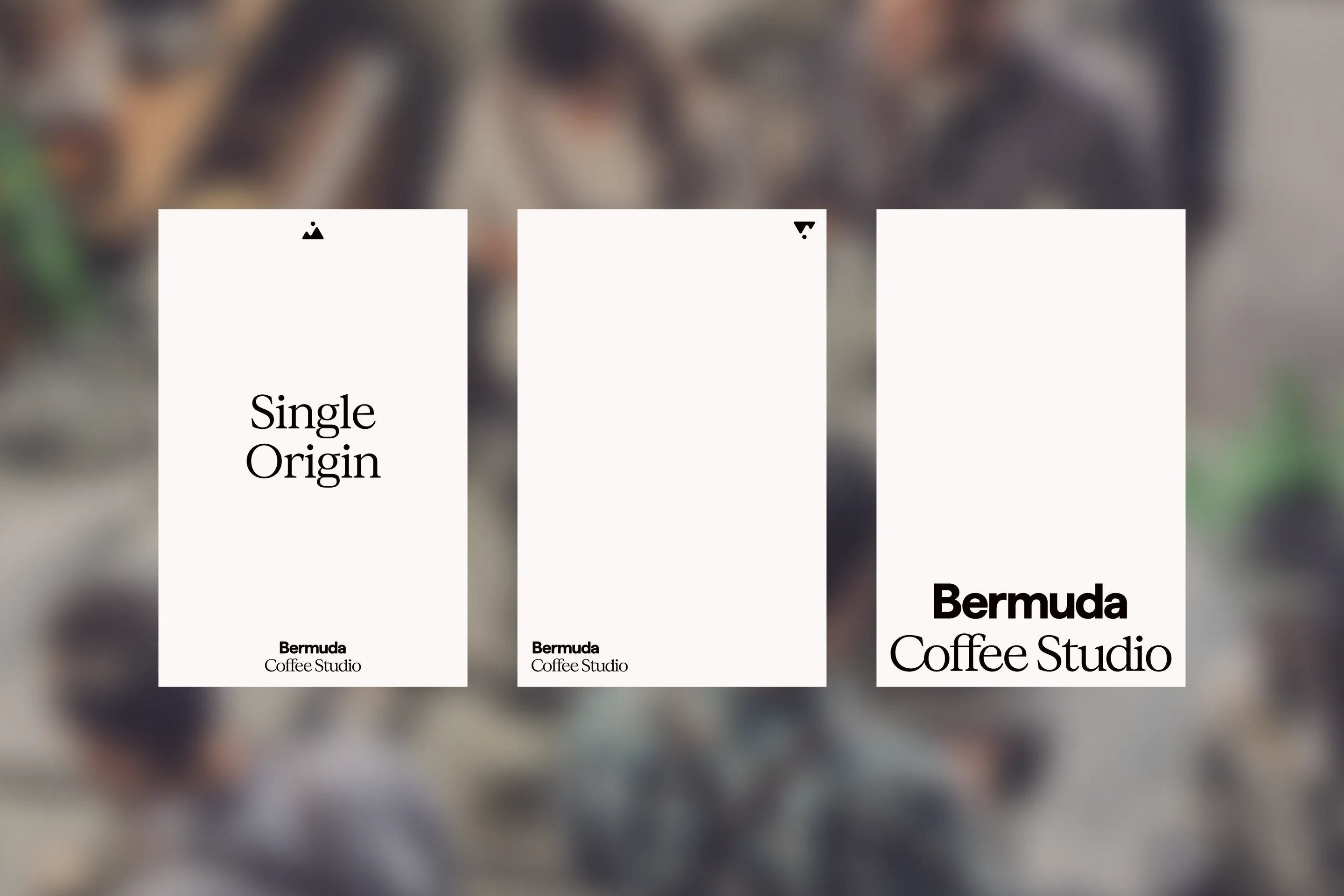
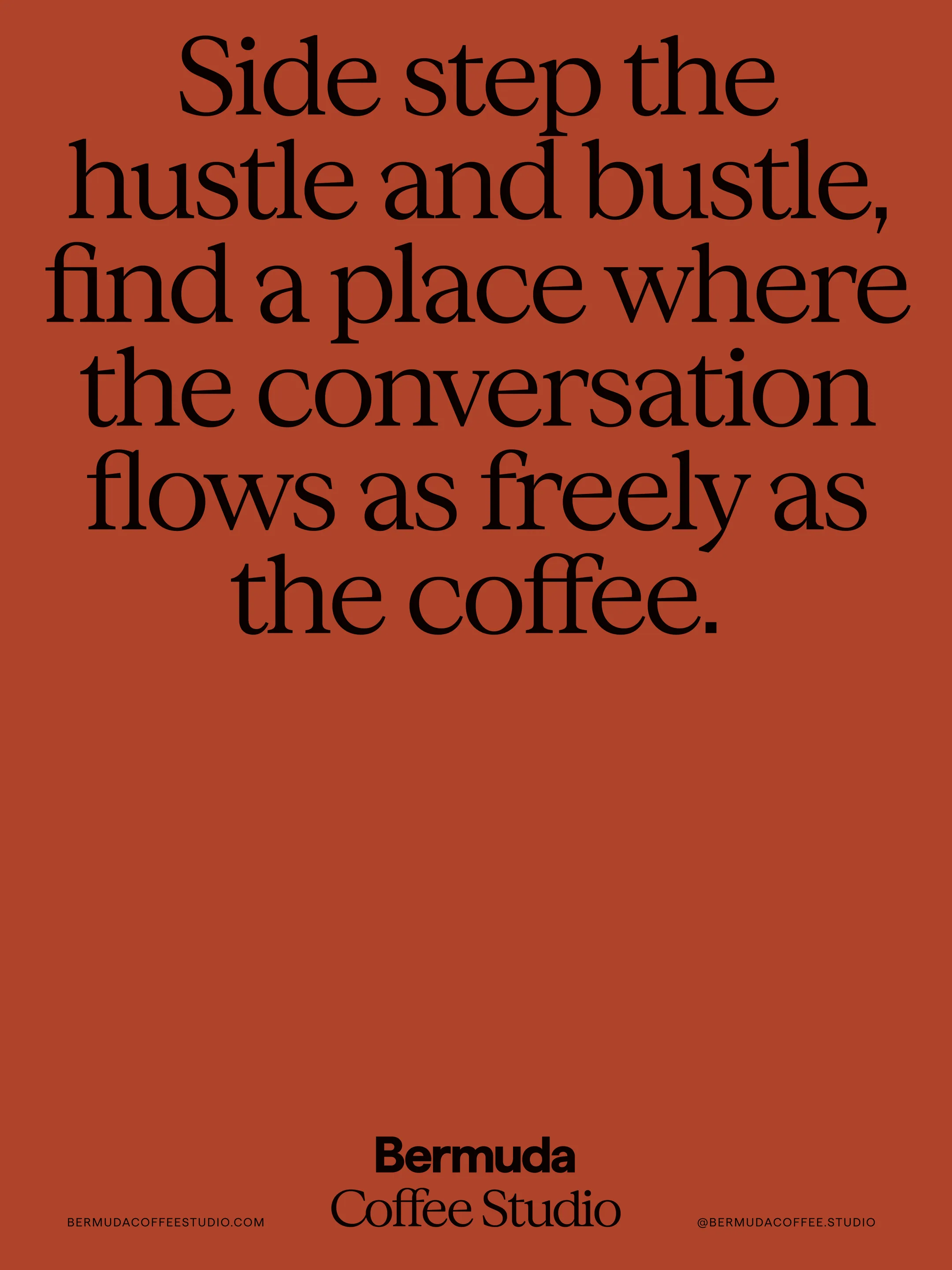
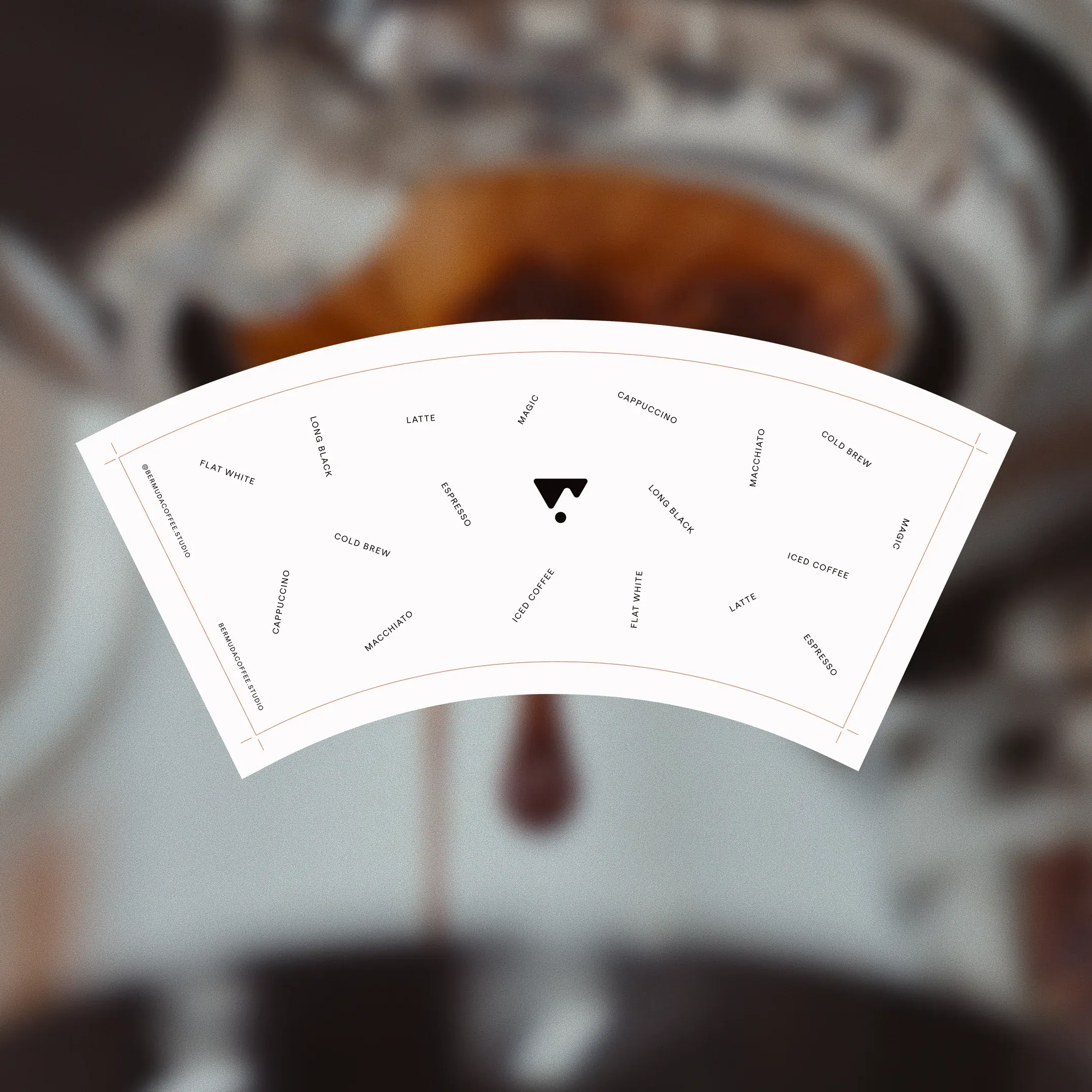
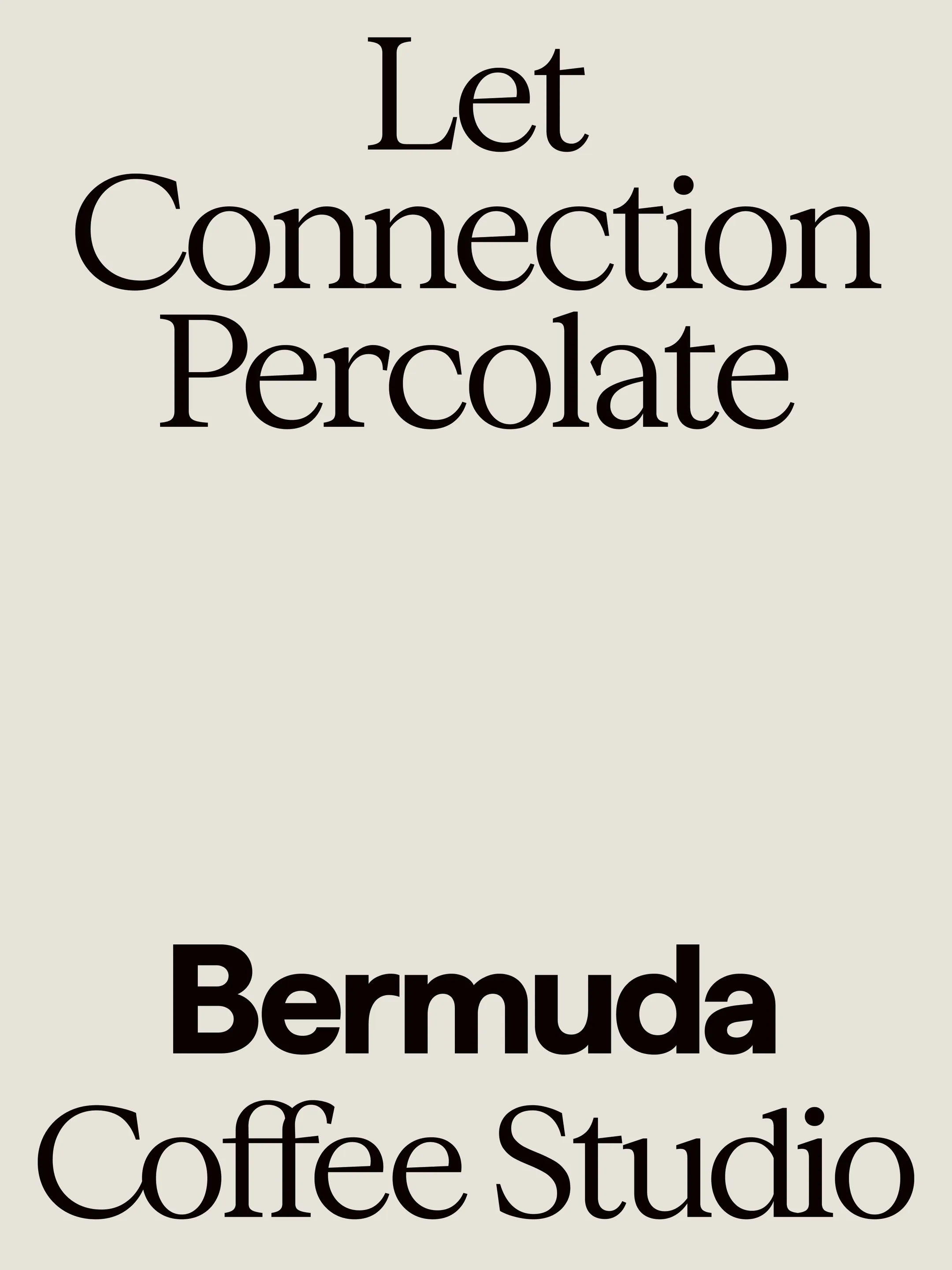
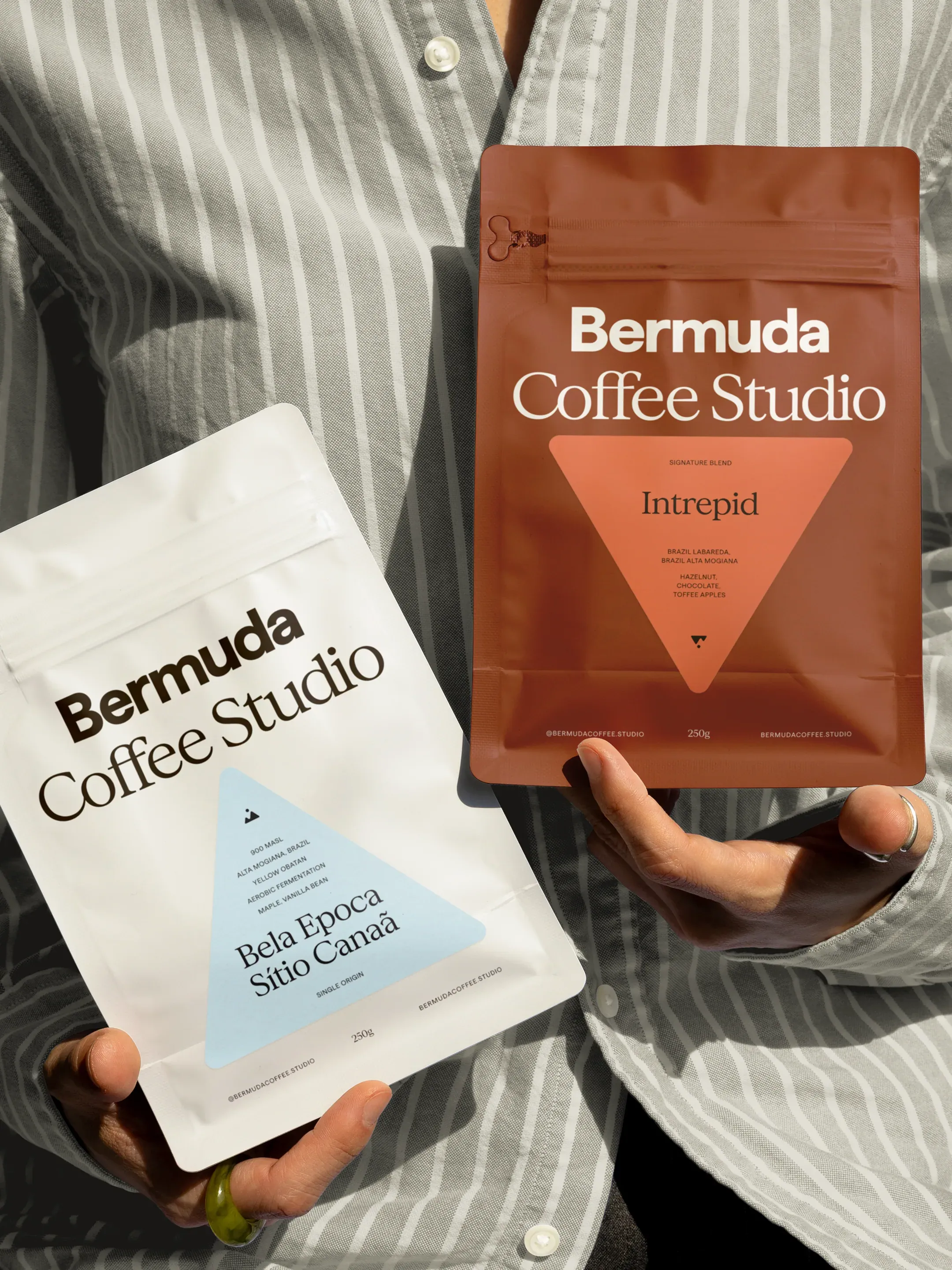
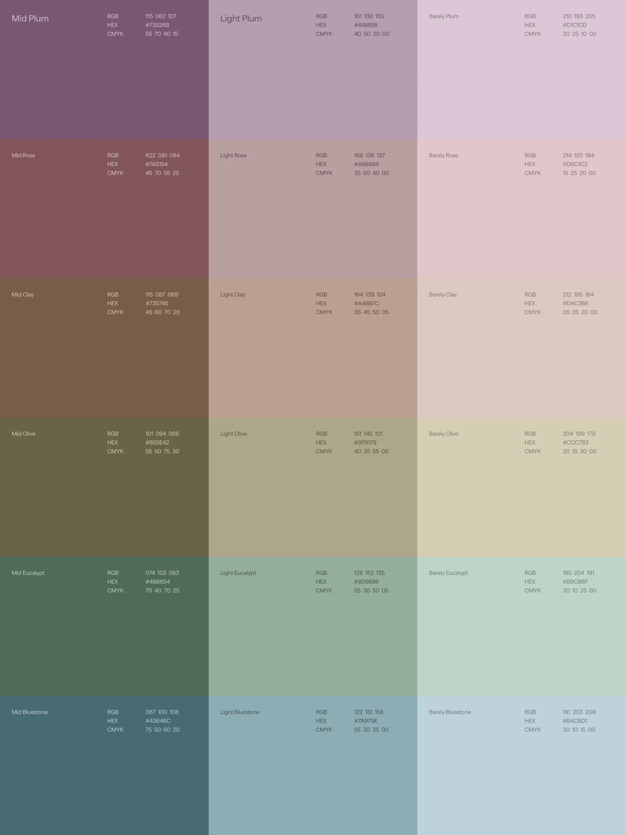
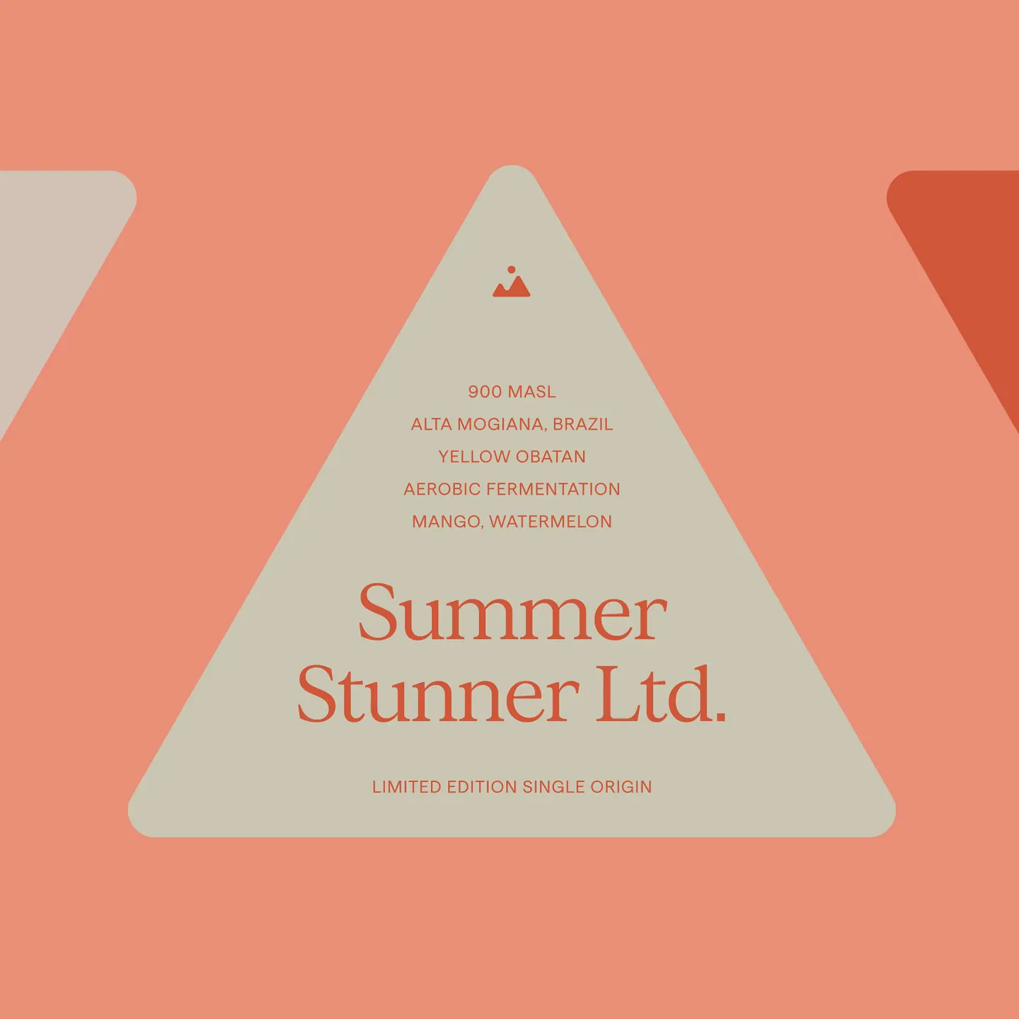
The mark references a pour-over cone and the drip that forms as it leaves a portafilter. A solid sans serif pairs with a refined serif, boldness and clarity from one, elegance from the other. Deep terracotta where Melbourne coffee runs black and white, with a secondary palette that keeps blends, single origins and limited runs fresh on the shelf. The triangular labels put altitude, variety, process and farm on the front, the provenance specialty usually hides.
Bermuda now hosts cuppings and workshops at a community-focused studio. Planning a visit? Bring an escape rope. You might just get lost in coffee.
Role
- Brand Strategy
- Visual Identity
- Verbal Identity
- Graphic Design
- Packaging Design
Industry
Program
Disruption
